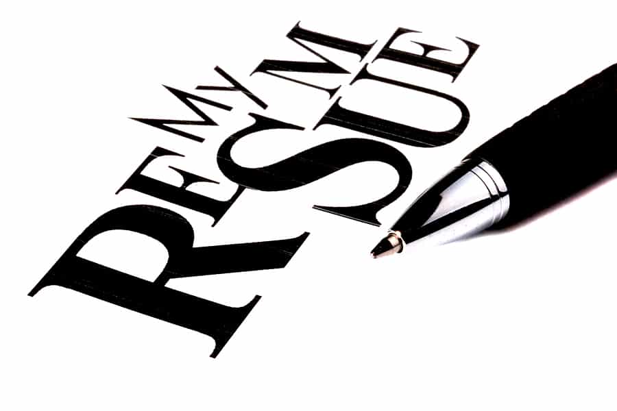
The Best Font Size And Styles For Your Resume
When writing a resume, you have to cover all the bases. Every section can influence the recruiter’s decision to invite you to a job interview. All key information must be provided and written in complete detail. You have to run a spelling and grammar check because these types of mistakes are unforgivable with recruiters. If everything appears in order, don’t submit your resume yet. Are you sure you used the best font size and style for your resume?
Why Your Choice Of Font Size And Style For Your Resume Matters
Recruiters are very busy people. Every day they go through hundreds of resumes. It can be a very tiring job. However, they carry on with their duties because they are tasked to find the best available talent for the company.
Consequently, recruiters have become very efficient in reviewing resumes. While it is important to have the key details on your resume, a recruiter will not read them with a fine tooth comb.
Instead, a recruiter will scan through your resume. He/she will look for keywords, specific skills, numbers, figures, and other details that are pertinent to the job position. In all, it may take the recruiter only 6 to 8 seconds to review your resume.
During this time, your resume should already make a strong impression. If it fails to do so, your resume may find its way to the 201 File.
For this reason, your choice of font size and style for your resume matters.
Choose a font style that is too sophisticated, and it may put off the recruiter or discourage him/her from looking for the important details. Choose a font style that is too small, and your resume will become a difficult read.
And let’s not forget the ATS or Applicant Tracking Systems.
An ATS is a software program that is used by Human Resources to pre-qualify resumes. It does this by tracking keywords and other relevant details.
Applicant Tracking Systems function better when analyzing basic or standard formatting styles than the fancier, more sophisticated fonts. It will have an easier time reading font styles like Arial, Times New Roman, Cambria, and Calibri than Pacifico, Caveat, and Comic Sans.
Therefore, in order to move forward in the hiring process, you should always use the best font size and style for your resume.
How To Choose The Best Font Size And Style For Your Resume
If you’re still with us, great! It shows you are really serious about submitting the best and most competitive resume to any prospective employer.
If you’re having second thoughts, keep in mind that recruiters for the biggest companies in the world take the candidate’s choice of font size and style seriously.
Steven Davis, who works as a Career Coach at JP Morgan which is one of the biggest banking institutions in the United States, believes that choosing the wrong font style and size will discourage the recruiter and guarantee your resume is “toast”.
Knowing the right font size and style is not a difficult process. For the most part, it comes down to common sense. To have a better understanding of what we mean, before you choose a font style and size, put yourself in the shoes of the recruiter.
What would you like to see?
1. Prioritize Font Visibility
Empathize with the recruiter. Make his/her job easier by using a font style that is easy to read. The font size should be large enough that the letters are very visible to the recruiter.
Remember, you should make an impression during the first 6 to 8 seconds. If your resume font is so small that the recruiter spends 6 to 8 seconds squinting and straining to read your resume, your resume may be on its way to the filing cabinet.
What is a good size for a font? It would depend on the font style. For example, a size 14 Calibri would be nearly as big as a size 12 Arial. Generally, the best font size would average from 10 to 12.
2. Keep It Simple
There is a saying in design that goes, “There is beauty in simplicity”. The saying can likewise be applied to your resume. Keep the look of your resume simple and professional.
Given the significance and importance of submitting the best resume to a prospective employer, it is easy to get carried away with the bells and whistles.
You want to emphasize certain details and information on your resume. However, you might end up overusing word processing tools such as bold, italics, and underline.
You may be tempted to mix in font styles and sizes. For example, you might use size 14 Helvetica in boldface for your sub-heading and size 12 Courgette for your details.
The short answer is: “No”.
Keep it simple and professional-looking. The recruiter will thank you for it.
3. Do A Sight Test
If you want to be sure of your choice of font style and size, do a sight test. After you’ve completed the draft of your resume, print out a hard copy. Look at it. Ask yourself if it is easy to read.
To be sure, ask someone whose opinion you trust. It will not hurt to take a small survey among a few friends and family. Tabulate the results and take note of their comments and suggestions as well.
The purpose of the sight test is purely visual. You just want to know for sure if the style and size of font that you chose have made your resume easier to read and friendlier to the eyes.
4. Size Matters With Your Resume
You might be thinking of reducing the size of the font from 12 to 8 in order to fit more information. Always remember that quality precedes quantity in resume-writing.
Unless your experience exceeds 10 years, keep your resume down to one page. Don’t be tempted to add to the pages especially if the content is not relevant to the job position you are applying to.
9 Best Font Styles To Use For Your Resume
There are a lot of font styles to choose from. However, choosing the right one for your resume is not rocket science. As we explained in the previous section, go with the most basic and simple style that will make your resume look professional.
We’ve taken away the guesswork for you and have made the selection process easier. Here are 9 of the best font styles that you can use for your resume:
1. Calibri
You may have noticed that Calibri is now the default font style of MS Word replacing Times New Roman. It is also the preferred font style of the aforementioned Steven Davis.
Calibri is a good choice because it reads well on a resume. This font style makes your resume look clean and more organized. It belongs to the sans serif group of fonts. “Sans Serif” means without a tail.
2. Gil Sans
Gill Sans is a font style that was designed in the 1920s and has its origins in the United Kingdom. It has withstood the test of time and remains one of your best choices of font style.
The design of Gill Sans was intended to give it a modern but classic look. The letters appear sharp and have great spacing to give it amazing clarity on a resume. This font style reads very well on a computer monitor.
3. Georgia
Georgia is a good example of a style from the serif family of fonts. Serif is a group of font styles that showcase a tail. It gives the font a more elegant, stylish, and sharper look compared to the simpler and blockier sans serif fonts.
Georgia is often referred to as “Times New Roman 2.0”. For a long time, Times New Roman was The Font. Every applicant and his brother or sister used Times New Roman on his/her resume. It was so popular that recruiters eventually got tired of it.
The difference between Georgia and Times New Roman is that the font style was designed to look better on a computer screen. That was one of the biggest drawbacks on Times New Roman.
4. Cambria
Cambria is a sans serif font and is considered by many recruiters as the more elegant version of the Calibri. In fact, the Cambria was created in 2016, the year broadband technology made the Internet more accessible.
The biggest strength of the Cambria is that it reads very well on a computer screen. In this day and age of computers, more recruiters view resumes on a screen than a hard copy.
5. Garamond
Garamond is a serif font that is also a nice alternative to Times New Roman. It has a more polished and elegant look and unlike the aforementioned Times New Roman is not overused.
Earlier we discussed the importance of keeping your resume down to one page. If you want more detail in your resume and still keep it down to one page, Garamond is the ideal font style for you.
It is compact enough to allow you to fit in more words on your resume. However, you will not compromise readability because of the spacing between letters.
6. Lato
Lato is a serif font that was originally designed as a “Corporate Font”. The idea behind Lato is to create a font style that would give corporate communication options without sacrificing functionality.
The drawback with Lato is that it may not be available in most versions of MS Word. You will have to download it for free at Google Fonts.
7. Helvetica
The Helvetica is considered by many typographers as the “greatest font style of all time”. So great, in fact, that a self-titled movie was made about the Helvetica!
What makes the Helvetica great?
Designers love the font’s clean lines and exceptional level of readability. Another bit of Helvetica trivia is that many of the most iconic logos use this font style – BMW, American Airlines, and Microsoft – to name a few.
8. Didot
If you want to get into an industry that requires a great deal of artistic expression such as fashion, photography, and graphic design, choose Didot on your resume.
Didot is a serif font that has been given a more upscale and modernized look perhaps due to its origins which are rooted in Paris, France. It has a delicate and softer look compared to other serif fonts which means it comes out well in boldface.
Thus, if you plan to use 2 types of font styles, Didot will be most effective as the font for your headings.
9. Trebuchet MS
Trebuchet is to Arial what Garamond is to Times New Roman. It gives job seekers a more modern and elegant version of a sans serif font that projects very clearly on a monitor.
Conclusion
We mentioned some popular font styles in our article but they are not featured in the list.
So what happened to Times New Roman and Arial?
For years, these 2 font styles were the most popularly used fonts on resumes. Times New Roman was the default font of MS Word until 2016. The truth is, these 2 font styles became a victim of their own popularity.
Recruiters simply thought the Times New Roman and Arial were overused and abused by job seekers. We mentioned how hard the job of a recruiter is – pouring through hundreds of resumes on a daily basis. They just had enough of it!
Besides, if you want to stand out from the rest, you should be different. If everyone was using Times New Roman, you should use another font style that would make the recruiter take notice while keeping the resume professional-looking.